

 中文
中文How to Make People Buy Buy Buy on December 12th?
The two – eleven smoke has been passed, so many relatives are chopped hand, so the problem comes, 12-12 our commodity details page how can be designed to let the user’s shopping cart still overloaded?
The product details page is the most easily accessible and resonant page of the e-commerce APP. The quality of the product details page design has a direct relationship with the user purchase conversion rate.Therefore, the good design of the product details page can stimulate users’ desire to purchase, dispel misgivings and enhance the trust of users!
Let’s take a look at the electricity funnel model: pull new (new users), active (commodities list page, page for details) – buy transformation (order, payment, trade complete) – spread (evaluation, sharing).
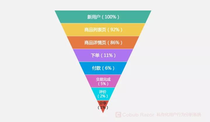
In the process of operating electric business APP, we tend to be the focus on access to new users and to generate income, many people think that as long as there are constantly new users into and someone buy, our APP operation was very successful.In fact, as long as we take effective measures against the product details page, it will be easy to pull new, buy, and disseminate these indicators.Good product details page can bring us more revenue, better customer experience and better APP performance.
Want to talk about is here, in front of the design product details page to fully market user research, user through the analysis of the historical data of consumption ability and interest preference, accurately understand the needs of users, there is not much more.Below, we will discuss the design of the product details page, and give the following five strategies and Suggestions:
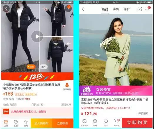
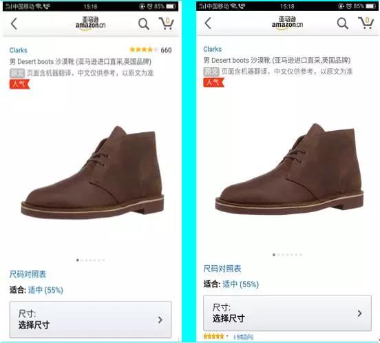
1. Reduce the number of buttons and simplify the operation process
Purchased in design process, we can only provide users with a CTA button (call to action, used to motivate the user action button), it can avoid to cause the user to choose difficulties can also encourage users to buy. Since there is only one CTA button, we have to figure out what kind of action the user wants to take. The “add to cart” button gives the user time to think, although it is the user’s point of view, but this can cause a certain disturbance to the user’s purchase behavior. We can think about our own online shopping scene: a lot of times when we add our products to our shopping cart, we will think, wait a while, maybe there will be a discount later? If only “buy immediately” button, this button will induce the user to purchase the item when browsing the product. Acceleration of the purchase process is conducive to the purchase of conversion rate.
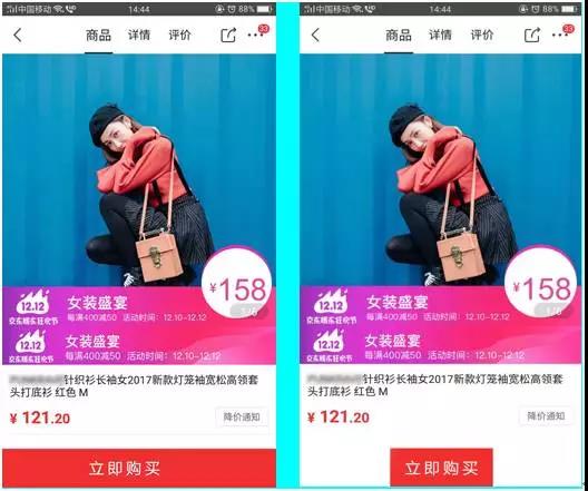
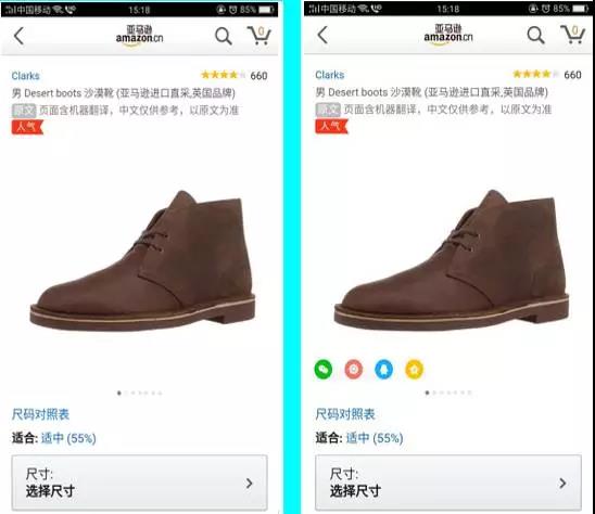
2.Magnify the CTA button to stimulate the user to purchase
Magnify the CTA button to make the CTA button appear more visible, allowing users to interact with the product more and stimulate more purchases. The design of the CTA button is too small to be coordinated in the full details page. The “instant buy” button in the atmosphere is more likely to encourage users to click.
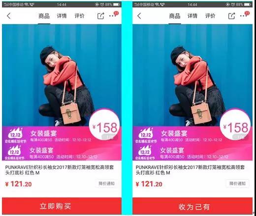
3.Guides the user through the text on the CTA button
CTA button intuitive persuasive words such as “buy now” can also, but “accept for their own” very good use of the weakness of human nature of greed, desire, possession of mental state, when to see their favorite things, we all hope that this thing is belong to own.
4.Place star rating in a prominent position on the screen
There’s a lot of information that can be displayed on the screen, and there’s no shortage of star ratings and ratings. Because good grades and reviews can help users quickly learn about the popularity of the product, it can also help to establish an authority in the user’s mind. Second, placing the evaluation in a prominent position on the screen allows users to make a good impression on the product.
5.Add the social sharing button to the product details page to promote communication
Adding social media buttons not only encourages users to share, but also facilitates user sharing. We are mainly used to share items on the current page. But in fact, the true use of marketing should not be limited to the product itself. For example, the record of successful purchase, or the interaction between the buyer and the seller, can be Shared content, which will be more communication than the commodity itself.
The above 5 points suggest that we can combine the A/B test to verify and ensure that the user behavior data we collect is accurate and effective. In the end, I wish you all the e-business friends 12-12 barley!